This Artistic Process: Day 2
- James Gummerson
- Aug 20, 2017
- 4 min read
So a few people have asked me about my process and insight in to how I paint. So I decided that I might share some of the technical details of the work and create a blog series and write a sort of day by day chronology of a piece I'm working on right now.
The painting was originally inspired by a walk I went on recently downtown. I always have my camera with me and on this beautiful warm night in August I decided that I needed some inspiration. I find that nothing gets my creative juices flowing like an evening or early morning walk. Whether its in nature or in the city, I can always find inspiration.
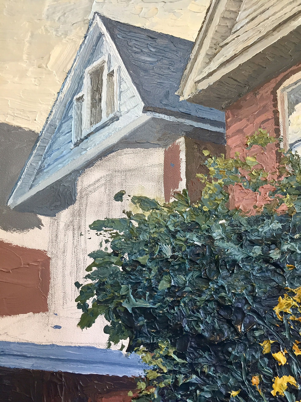
Yesterday I posted a photo of the full painting not yet finished. Here I'm working in the houses at the top left of the painting. I like to use my paint very thickly. I love the texture it brings and adds a 3rd dimension to the piece. Sometimes I use a brush and other times I use a plastic butter knife. Now I hear some people out there saying "...a plastic butter knife?". I only started using it this year and sort of by accident. I was applying paint right onto the canvas with the knife that I was mixing the paint with. As I applied it, I noticed I could get a different texture than the brush. I have been using it off and on ever since in my work.
As I was saying, I was working on adding these houses into the background. They are a little tricky because you have to paint the diffused color. Because they are a little farther away than the foreground elements, the colors becomes cooler, and muted. They take on a blue sort of hue. Here's when your color matching is tested. Those seemingly dark tones are lighter than you would expect. Washed out. Getting the lighting and tones right are the key to good painting. In fact, it is and will always be more important than color. Just look at Monet's work. Alot of people think he was focused on the beautiful colors, but it is well known that he was focusing more on the myriad of tones available in a scene. The colors could virtually be anything but if the tones are right... your brain gets it. Your eyes are not confused by the lighting or depth in the scene. If your tones are wrong... or if they are all generally the same in the painting, you will achieve a boring and mundane piece. Not to mention your brain will get confused. Things won't seem right and well... in the words of Andrew Wyeth you've created "a flat tire". Don't get me wrong. Color is important. I'm just saying that if your colors are off but the tones are right, you'll be better off.
You'll notice some pencil lines on the canvas. These are very loose lines and very rough and help with proportion. I don't draw in everything, I like to do that with the paint. I used to use yellow ochre watered down to paint in the lines. I learned that in art school. But I found over the years that it distracts my color sense when i'm painting. Throws me off when I am painting a nice cool color next to the yellow ochre line. It's hard enough to balance your warm and cool colors without having to contend with warm colors all over the place before I even start painting. A light pencil does just fine for me now. Some artist like to prime the canvas with a different color... whites just fine for me.
In my last post the paint is kind all over the place in the painting. I do this for one main reason: To understand all the colors and tones all at once. I also do an under-painting of very thin colors in areas all around the painting. I've seen some artists get so finicky with detail at the beginning of a piece (including myself along time ago I may add). You cant understand all the tones and lighting and volumes of air without working it all out first. In fact I've seen some well known artists who's paintings are super detailed and are as flat as a pancake and some who are much less detailed and have the beautiful illusion of environment and space mainly because they understand light and tone. They understand that you don't see every blade of grass from a distance. That you don't see every hair on an animal, and that becoming more realistic is painting what you see, not what you think should be there. I try to work the whole thing, comparing tones and elements back and forth, back and forth.
Well I think that covers it for Day 2 and thanks for reading. Stay tuned for Day 3 and I'll cover some compositional insights.
Comments